26 August 2010

NYC


One of the best bits about America, Nerds and Mountain Dew


View of NYC from the second room we were given in the New Yorker hotel. a.m.a.z.i.n.g.


Here are some photos of the B&B that we stayed in. It was situated on the edge on a lake with only one house, and some woods for neighbours. The couple on the right hand side on of the image above were the owners of the house we stayed in, very friendly people, they made us cookies every day and pancakes galore for breakfast. Most good.

New York!

Wow, it's been a while, and in this time I have done a lot. Been to New York and Amsterdam, finished my second year of university, went on a road trip in France with my best friend, touring our favourite vineyards (Chablis et Champagne). Then over the summer I have just been working at home in a pub which is no where near as exciting or adventurous but at least I might be able to start third year with a positive balance in my bank account!

I will start documenting this time with some photos from New York.


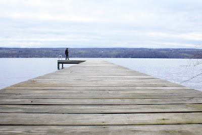
We spent four days in NYC then got a train to Niagra, spent one day (Two nights) there, then hired a car and drove back to NYC, we stopped in Finger Lakes on the way for a few nights, to help break up the journey. Finger Lakes was beautiful! These photos are from Finger Lakes.


17 March 2010

Infographic.


4/5 week project on infographics! I'm not sure there is a single person in the class who can honestly say they have enjoyed this brief. We had to choose a personal topic which we could represent through an infographic. This isn't just a graph though. It's a graph which has been designed by an anal designer who thought they could improve the perfectly adequate bar graph and pie chart, by making it look nice.
Here is mine. It represents how much money I spent in one month compared to how much I should have spent. Each section shows a different item and how much I spent on it.

A short two day brief.
We had to design a poster in InDesign, which had very strict guidelines i.e. typeface to use, point size to use, had to be two colour, had to include D&AD logo and the text to use was all given to us. The poster had to be designed with Swis influence and was then to be screen printed. I'm not so keen on my poster but I love screen printing.